103.9 ROCK FM
Solid as a Rock


At the beginning
How could you present an analog, raw, classic thing like the a rock music in a digital world? This was the main question in my head when they were hired me to design the branding of the radio station.
Inspiration


The Process
Main idea
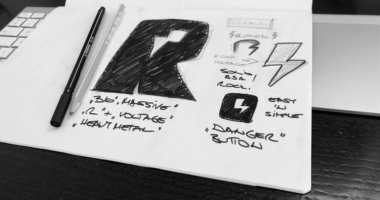
Concept first. Design later.
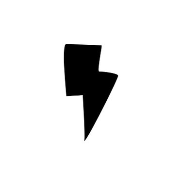
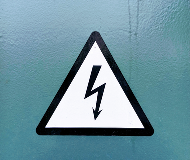
I think a logo could be unique and iconic if it is compact as possible. My main inspiration came from these 3 pic: a rock star, stones and the dangerous high voltage sign. I knew at the end it should be very compact and easy to recognize.

Other ideas
Here are some other logo ideas from the beginning. Originally I designed a highlighted version "FM 103.9" with red color. But we decided to use only the black 'n white version from the start. As You see, on the website below.
Official logo
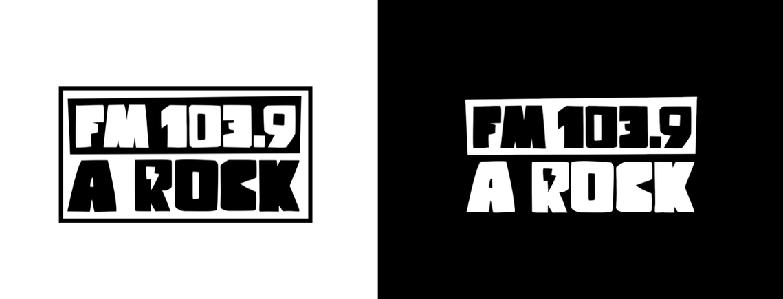
Logotype
Both logos, the primary and the secondary (invert) logotypes based upon the highest contrast as possible. In this way it will work well in print and in digital environment too.

Monochromism
The biggest contrast is between the black & white. These two work together dramatically, but never go out of style.
Responsive logo
Responsibility is super important. From the billboard to an Instagram avatar: a logo could work on an 18 meter wide print and in an 18-pixel header of an application with the same effect.
Mobile & web UX

Superblack official website mobile look.
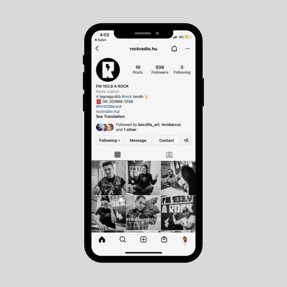
Instagram profile with "R" avatar on white background

Instagram visual


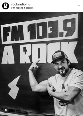

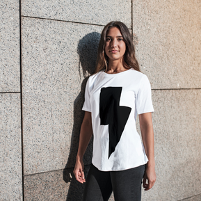
Merchandise


The Team

Creating something big, like a radio station is always a teamwork, and I'm glad to work with these guys. They are really nice & cool people in life, even great professionals.
From left: Zsolt "Carlo" Karlovits (Sound design), Péter Bazsa (Music director), myself Levi Gaál (Art director) and László "McFly" Bartók (Brand manager, PD)
Broadcast studio branding